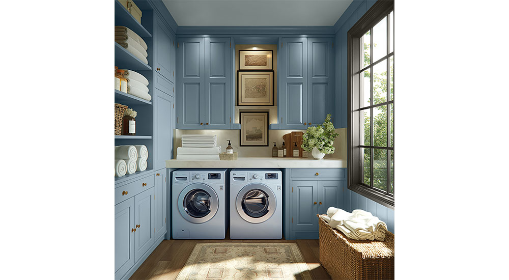
The Pittsburgh Paints brand has named Artifact (PPG10-16) the 2027 Color of the Year. A warm, smoky blue, Artifact brings a steady sense of calm to a space to restore and renew. It calls on homeowners and professionals to recalibrate and return to colors that draw on instinct and authenticity over perfection.
Pittsburgh Paints color professionals forecast Artifact as the top trending color of 2027 as a reflection of societal sentiments leaning toward a collective desire to return to what once felt steady and defined our homes and spaces. It is a familiar, enduring blue that imitates a protective cocoon or haven of safety.
“Artifact invites reflection and calls us to pause, reassess and reconnect with what’s essential and gives meaning to our lives,” said Michelle Vincent, Pittsburgh Paints color and design manager. “Artifact creates balance without feeling flat. It is nostalgic, but not regressive, by pulling forward what was good from the past and reshaping it into something newly personal and curated. This color feels rare not because it is loud, but because it is used intentionally.”
Drawing inspiration from water, Artifact pulls from the vitality of greens and the depth and fluidity of blues. Like water, the color adapts to its surroundings while channeling an energy that invites reconnection with nature.

According to Vincent, in 2027, homeowners and professionals alike will be choosing colors that are rooted in longevity and give authorship over spaces that reflect personal style preferences. This comes to life through three key design collections.
The Foundations Collection returns to what matters most, stripping back to essentials to create spaces that feel grounded, clear and purposeful. Anchoring hues like Smoky Slate (PPG1028-4), Thyme Green (PPG1128-6) and Chocolate Truffle (PPG15-13) create a sense of stability and ease, establishing a strong foundation for reflection, possibility and for recalibration to begin.
The In Motion Collection embraces change as an active, ongoing process. Within this collection, colors such as Smoky Orchid (PPG1179-2), Nostalgia (PPG1049-3) and C’est La Vie (PPG1120-6) introduce greater contrast and expression, reflect spaces that adapt, respond and evolve alongside the people who use them. Bold, unexpected tones invite experimentation and personalization, capturing the energy of environments in transition and the freedom to adjust along the way.
The Resolution Collection settles into a state of quiet alignment, where every space feels balanced, refined and complete. A thoughtful blend of hues like Craftsman Gold (PPG1092-4), Juniper Berry (PPG1145-6) and Discover (PPG1021-3) brings both depth and calm, moving away from excess toward thoughtful curation. This is recalibration realized, an environment that feels cohesive, intentional and comfortably lived in.