Confronted with an empty nest and the ho-hum kitchen that hadn’t changed since they bought the house in the 1990s, the clients for this renovation glow-up were ready for more functional space, a happy color scheme and a design to suit their personalities.
“They are big cooks and big travelers, and they love to try new things,” said Kieran Fannan, project architect with TriVistaUSA in Arlington, Va. “Now that their kids are grown, they knew they’d be having bigger family events there and wanted a space to match that.”

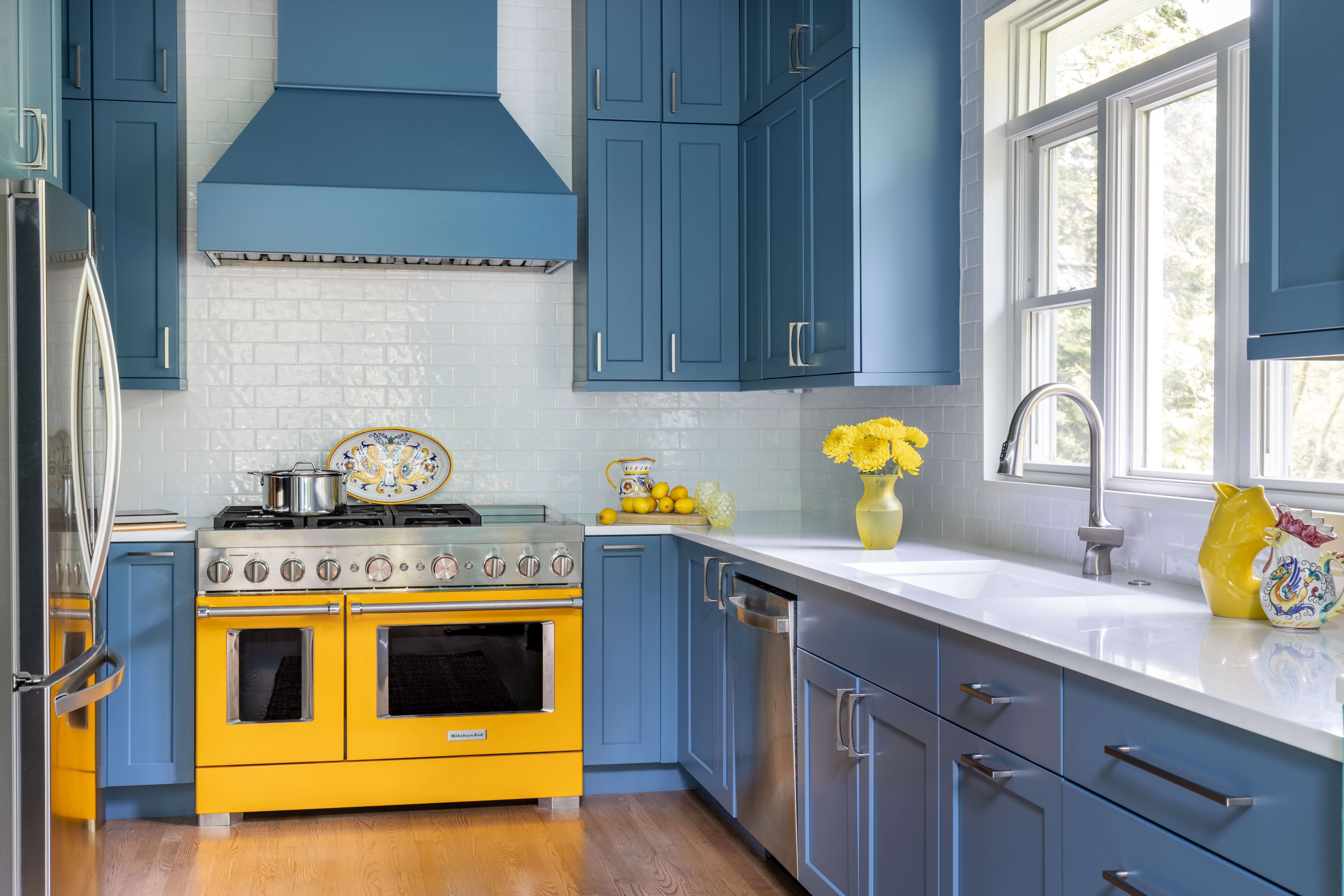
The clients loved the idea of a bright yellow range after seeing it in a photo of another kitchen. Once they found the model they liked best, the design team picked out the contrasting blue cabinet color and bright-white tiles and countertop to complete the tableau. Photo credit: Nova Soul Imagery
The owners live in the Arlington area, as well, and they chose TriVistaUSA based on reputation and local word-of-mouth. The project scope included the renovation of the existing kitchen and eating area, plus the addition of a three-season room (replacing a deck), which largely addressed the functional piece of the brief.
Here Comes the Sun
Gathering images to share with TriVistaUSA for inspiration, the clients came across a photo featuring a bright yellow range. They loved the idea of such a vivid focal point, so they started there. Once the right brand and model were settled on, the design team turned their attention to the rest of the palette.
A cool, classic blue on the surrounding cabinetry provides a nice complement to the range, while bright teal paint covers the walls of the dining nook and the new addition. The white countertops and walls in the kitchen, along with the white paint on the trim and built-in benches in the nook, keep the space from overwhelming the eye.

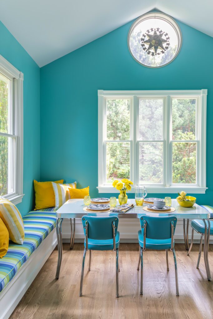
An existing breakfast nook was opened to incorporate built-in benches and a table to improve upon the previous bar-and-two-stools setup. The bright teal walls are a happy complement to the adjacent blue kitchen cabinetry, while the ample windows keep everything light. Photo credit: Nova Soul Imagery
“The darker shade of blue in the kitchen worked really well because of the amount of light the room gets,” said Fannan. “The ceiling heights are over 10 feet, with tall windows on the south side of the house. The daylight coming in really highlights the space.”
Completing the Picture
The high ceilings also presented an opportunity to reconsider the cabinetry: Should they keep the lower, furniture-styled look of the previous cabinets or take the new ones all the way up? After a lot of discussion, the clients opted to gain more storage by using the full-height space.
As a nod to the house’s age (around 100 years old) and a simple way to introduce a more classic design element, Fannan and his team employed white subway tiles for the kitchen walls. Yellow fabrics and accent pieces tie all three spaces – the kitchen, dining nook and three-season room – together.
The renovation was commissioned during Covid and had a hard stop to be ready by the homeowners’ daughter’s wedding. With the entire design centering on the unique range, the supply chain issues of the time were more than a little concerning.
“[The manufacturer] told us we could get it in six months, or we could get it in a year and a half,” said Fannan. A temporary stove was planned as a workaround, but luck was on their side. “Out of nowhere, we got a call saying the range had just appeared in the warehouse. It ended up arriving earlier than we’d planned for, allowing the kitchen to be completed in time for the wedding,” he added.

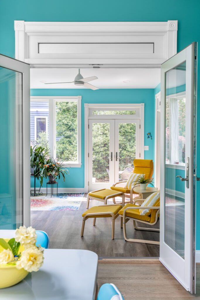
This three-season room addition replaced a backyard deck and expands both the color scheme and the space for entertaining. Photo credit: Nova Soul Imagery
Personal Space
The finished project is a joyful integration of the owners’ personal sensibilities into a previously neglected area of this older home.
“The house has such a unique feel, with all the art and décor, so this kitchen redesign fits the clients very well,” said Fannan. “It’s very personalized and tailored for this family.”
While the bold color scheme may not be exactly “timeless,” the design’s shelf life will hopefully be long, as the clients settle in and prepare to host family events for the next generations.
“They just wanted it to be a happy space,” said Fannon. “They love entertaining, and they didn’t want your run-of-the-mill white kitchen – they wanted something really fun.”
SOURCES:
DESIGNER: TriVistaUSA; PHOTOGRAPHER: Nova Soul Imagery; CABINET PAINT: Sherwin-Williams; CABINET PULLS: Top Knobs; CABINETRY: Wynnbrooke; COUNTERTOP: PentalQuartz; DISHWASHER: GE; FAUCET: Pfister; REFRIGERATOR: LG; SINK: Blanco; RANGE: KitchenAid; HOOD: St. Clair Kitchens (custom)


