Choosing the right colors is crucial when you are designing a
kitchen, be it for cabinetry, tile, flooring or even
hardware. When reviewing cabinet options, for example, not only should you be looking at whether you want a raised or flat panel door style, a durable
surface on both the inside and outside, as well as an efficient layout to fully accommodate your client’s needs, but you should also be really “fussy” about selecting the perfect hue, shade, tint and/or tone. Creating the right
color combination is critical and can mean the difference between a space that is ho-hum and one that is stunning.
Following are some important ideas to keep in mind when designing your new kitchen:
1. If you decide you want two colors for your kitchen cabinetry—one for the
wall or perimeter units and another for the island, for example—make sure they’re different enough from each other that your selections look
intentional. If not, the result will look like you tried to
match the colors and failed.
2. Choose hardware that stands out from
the cabinets. A white porcelain knob on a white cabinet will get lost visually, whereas a rubbed bronze knob on the same white cabinets will give
you more style.

3. Also, keep in mind the color of your faucet when selecting
your hardware. Although they don’t have to be exactly the same, they
should be colors/finishes that will work together.
4. Often the hardware on your cabinets is an opportunity to add a little
sparkle in the room. For the understated kitchen without a lot
of colors or textures, a cut-glass-style knob or a colorful door knob
can be the perfect jewelry to accessorize the design.
5. Create a backsplash that lightens your workspace. Going darker will
darken work areas and work surfaces, thus requiring more task
lighting, while paler colors will add brightness by reflecting light onto countertops.
6. A hard-working component of any kitchen, the kitchen sink demands a
color/finish that is as appealing as it is functional. Keep in mind that a sink in a
lighter tone or even stainless steel tends to appear clean
and bright whereas darker options may blend in with the countertops but
will lose that feeling of cleanliness.
7. Take time to evaluate and examine your work surface selection before placing an order. Some people may find a black, shiny countertop hard
on their eyes and feel more comfortable living with and working on one in a medium or lighter
color.
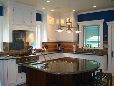
8. When choosing an island work surface, either opt for a color that differs noticeably from that of the perimeter countertops or go with a completely different material. As an example, you might specify granite for your built-in cabinets and then contrast it with a beautiful
wood surface on the island.
 For visual interest, differentiate the island countertop from that of the perimeter cabinetry by selecting a contrasting color or material. Photo courtesy of Amy Wax, Your Color Source Studios.
9. However, if you do use wood for your island countertop, avoid choosing one in the same color as the cabinetry below. A dark wood or black
island might work better with a lighter wood top and vice versa.
10. Finally, the color of the walls of your kitchen should contrast
with that of your cabinets. To really show off the cabinets, make sure they stand out against the color of the room.
Hopefully, you’ll find these color ideas useful. People
frequently select a function or style they like when designing their
kitchen without remembering that selecting the right color, or depth
of color, can make or break a kitchen design.
—Amy Wax is an architectural color consultant and principal of Your Color Source Studios in Montclair, NJ. She is the recipient of a 2010 Benjamin Moore Hue Award for Residential Exteriors and VP of the International Association of Color Consultants of North America( IACC-NA). Wax also served on Benjamin Moore’s first Residential Advisory Council, and her book, Can’t Fail Color Schemes, published by Creative Homeowner, has been recognized with several awards. Her latest is Can’t Fail Color Schemes: Kitchens & Baths.


