Sharon L. Sherman, KBB’s 2025 Person of the Year and founder of Thyme & Place Design, shares her thoughts on how some in the design community have reacted to the choice of “Cloud Dancer” – described as “a billowy, balanced white imbued with a feeling of serenity” – as the 2026 Pantone Color of the Year:
Color shaming has no place in our profession.
Some of you are going to agree with me here and some are not. In a world so divided, why are we taking such a strong stand against a color?
As a longtime designer, I’ve seen trends rise and fall. I’ve embraced wild palettes and minimalist schemes. I’ve worked with fearless clients and cautious ones. Through it all, one principle has guided me: Respect the power of perspective and personal choices.
So when I witnessed the backlash directed at Cloud Dancer, Pantone’s Color of the Year, I wasn’t just disappointed, I was concerned.
When did our community become so quick to judge? To label a color as “useless” or “uninspired” without considering the why behind it? Color is storytelling. It’s emotional resonance. It’s memory.
For me, that soft, airy hue conjures a childhood filled with sky-gazing, watching the beautiful patterns created by the puffy white clouds drifting by. In my design school days, it was the base of every paper or canvas I used for drawing or painting, inviting, not plain. White was never blank. It was beginning.
The backlash feels personal because I’ve built a career spanning many years using color with purpose, not popularity. And soft whites, cloud creams, and chalky neutrals have been constant companions. They frame bold choices. They cool intense palettes. They bring elegance and calm.
So why the public shaming? Are we so trend-obsessed that we can’t appreciate restraint? Is it still not our job to interpret, adapt, and elevate?
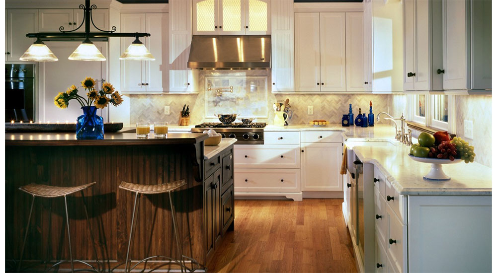
Design is not about echo chambers. It’s about empathy, listening, and delivering spaces that serve human beings. Off- and soft-white color was everywhere at the fall furniture market. Why is there such a discussion around this selection?
I believe we owe it to one another to discuss, not dismiss. To reflect, not ridicule.
Color is not competition. And a professional community should not feel like a battleground of personal taste. That isn’t how we elevate this industry. That’s how we diminish it.
So many clients are struggling with the current climate in our world. For them, this type of color is calm in a storm of feelings and emotions. Let us not forget, we want our clients to have homes that reflect them and how they want to live in that home. Why are we attacking a color just because it is not what we think is the best choice? For me, this soft white is like a breath of fresh air.
Let’s create space for conversation.
—Sharon L. Sherman


