While 80s-era trends are back on many fronts, there are some we can do without, as proven by one 1980s-built home in Westchester County, N.Y. Here, the original builder’s attempt at being modern and edgy backfired both aesthetically and functionally, especially in the house’s kitchen and primary bath. To beautify these ugly and outdated spaces and to them more livable for their young family, the homeowners searched online for top-rated local firms in their town of Mamaroneck and found ND Interiors, led by Nancy Davilman.
Wide-Open Spaces
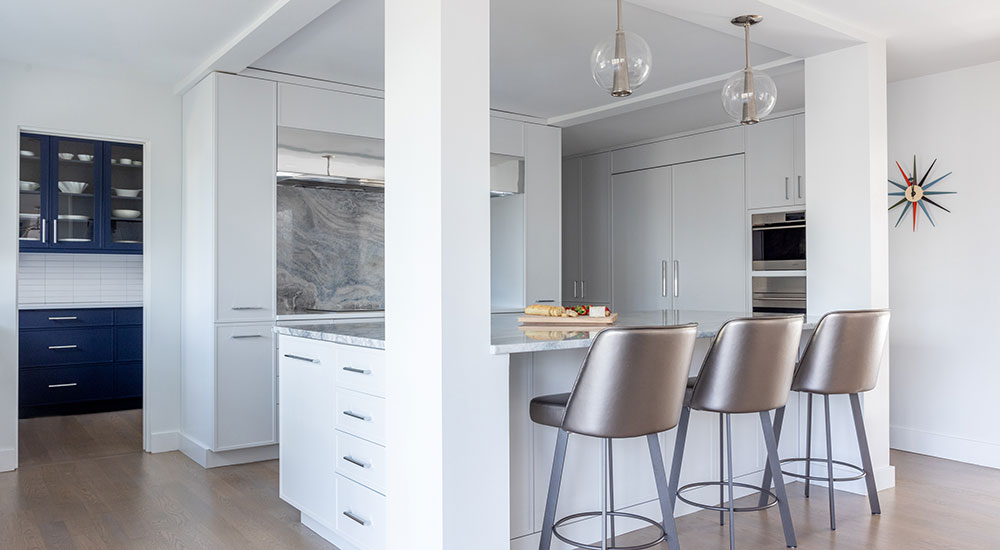
Although the existing kitchen was spacious at about 260 square feet, its choppy layout of disjointed countertops and quirky components – such as a triangular island at the room’s center – proved impractical and disruptive to the natural flow of prepping and cooking. It also didn’t give the wife the direct line of sight she desired to watch over the children while working in the kitchen. Finally, the combined countertop space was insufficient, especially should the cooking turn into a family affair.
To tackle all these issues, Davilman worked with KTM Architect, who helped open and rejigger the first-floor plan substantially. In addition to ripping out and repositioning the home’s main staircase, the team opened the dining room by taking down two walls: one that demarcated a hallway between the dining and family rooms and another that separated the dining room from the staircase and an adjacent alcove space. The wall separating the kitchen from the dining area was also demolished to provide seamless flow between cooktop and tabletop. With these key spaces now open to each other, the project teams were able to carve out spaces at the back of the kitchen for a laundry room and butler’s pantry – which added significant storage and prep space – without making the kitchen feel small.

Singing the Blues
The teams removed the existing yellow-toned wood cabinetry and countertops, which were made of a dated greenish-black granite, as well as appliances and fixtures to make way for gleaming white cabinetry anchored by quartzite with blue, gray and white swirls.
“I really wanted the clients to choose and fall in love with a slab, but we didn’t know how prominently we were going to feature it, as we were still in the design phase,” said Davilman.
Once the clients chose it, however, the designer felt a stone so striking belonged behind the cooktop, as well as on the island. After cladding the cooktop’s backsplash, she used the rest of the stone to top the extra-deep island – creating an overhang where the children could do homework or play – and wrap down one side all the way to the floor.
The sink wall, to one side of the island, has a ceramic tile backsplash that appears white but actually has a very pale green-blue undertone. In the butler’s pantry, the backsplash switches over to white, but the cabinets are drenched in a vibrant and lighter navy blue. Here, and elsewhere along the kitchen’s perimeter, the countertops are white engineered quartz. Opposite the sink, on the other side of the island, white-paneled fridge and freezer units blend in with the kitchen cabinetry and sit next to new wall ovens.
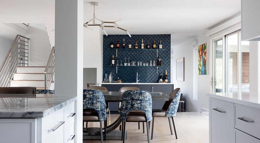
As the kitchen overlooks the dining room, the dining chairs reference the stone centerpiece with blue, gray and white back fabric, while the seats are upholstered in a textile with metallic sheen. This carries over into the dining room’s new wet bar (formerly the staircase-adjacent alcove), where eye-catching shimmery, almost metallic blue tiles clad the wall above a hammered stainless sink.
Room to Bathe
Like the kitchen, the primary bath suffered from an outdated palette and inefficient layout. Wedged in the corner between the drop-in tub and toilet was a tight shower with an awkward angled entry. A makeup table accompanied by a massive mirror took up nearly the entire window-side wall, and the overall palette was very beige. Fortunately, the design team was able to work within the existing bath footprint after removing all these impediments.
One of the clients’ requisites was a standalone soaking tub. Davilman said the wife really is a bather who actually uses the tub and doesn’t just have it for show. What she didn’t care for, however, was the extra-wide makeup table. So,with that removed, the designer positioned a new soaking tub along the window wall which, gained another window opening in lieu of the makeup table’s oversized mirror. A more appropriately sized table and wall mirror now sit in place of the old drop-in tub, while the toilet was shifted into the corner where the old shower stood. This move made space for a larger steam shower facing the windows.
Bling once again finds its way into the design, this time in a carved and hand-painted marble shower wall tile that possesses gold undertones and catches the now abundant sunlight. To complement these tiles, the homeowners chose a glass mosaic that has some beige but mixes it with a lot of pearlescent browns, gold, bluish-gray and ivory for the shower ceiling and shelf niches.
“The clients really didn’t shy away from color, and they loved the depth and richness of color in this product, said Davilman.
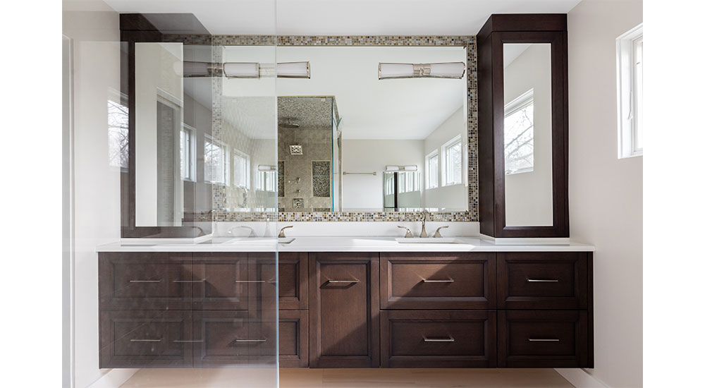
The only element to stay in its predecessor’s spot, the all-new double vanity features cabinetry that picks up on the mosaic’s deep dark coffee brown. And tying the bath design altogether, the designer added the finishing touch of a “frame” around the vanity mirror composed of the very same mosaic.
In terms of lessons learned on this project, Davilman said one thing that was reinforced on is how important great communication is among all the team members.
“No matter how perfect plans look on paper, there are always items that come up once you’re into the construction phase, and it’s important to be able to quickly brainstorm together and make proper decisions,” she added. “Having your team of architect, builder and designer working together from the start ensures a smoother process overall.
Sources
Designer: ND Interiors Architect: KTM Architect Photographer: Julie Leffell Photography KITCHEN Backsplashes: AKDO & Everest Marble Cabinetry & Hood: Majestic Kitchens & Baths Cooktops & Oven: Wolf Countertops: Everest Marble & PentalQuartz Dishwasher: Bosch Dining Room Chandelier: Modern Forms Faucets: Delta & Kohler Freezer & Fridge: Sub-Zero Hardware: Sietto Hardware & Top Knobs Microwave: Sharp Pantry Fridge Drawers: GE Monogram Pendants: Laura Kirar Sinks: Blanco & Nantucket Sinks BATH Cabinetry: Majestic Kitchens & Baths Countertop & Shower Seat: PentalQuartz Faucets, Shower Fixtures & Tub Filler: Brizo Floor Tile: AKDO Hardware: Top Knobs Mosaics: Terra Tile and Marble Sconces: Visual Comfort & Co. Shower Wall Tile: Elalux Tile Sinks: Kohler Tub: Fleurco


