As designers, we all eagerly await the announcements of the upcoming “Color of the Year,” as determined by various paint companies and color experts.
These companies and their color specialists take many factors into consideration when making predictions about which colors will catch our collective eye. Developments and trends in fashion, food, entertainment, the arts, sports and even politics might influence the national mood and show their colors via the ones deemed “most popular.” Think about the 2023 film “Barbie,” when suddenly we were all enveloped in a cloud of bubblegum pink!
Color and Culture
Not all influences are as in-your-face and widespread as “Barbie,” but when these colors are announced, they can usually be traced back to societal or cultural factors that spent some time in the spotlight.
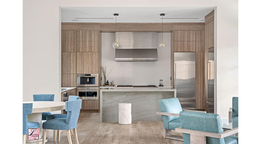
For 2025, the Pantone COTY is “Mocha Mousse” – a collection of velvety deep browns – that are rich and decadent, suggestive of the qualities of chocolate and coffee. Could this be in response to a popular cocktail that came on the scene a while back but whose popularity continues to grow – the espresso martini?
Benjamin Moore selected “Cinnamon Slate” for this year’s honor – all warm and soothing hues. We might tie this back to the surging popularity of bourbon, evoking thoughts of dark, earthy browns swirled with golden reds. It’s not a big jump to imagine that our bourbon consumption resulted in the popularity of the color families it reflects.
Purple Reign?
Though Pantone, perhaps the leading color indicator, has not yet released its 2026 selection, many in the design industries are rooting for lavender. We’re living in tough times. Life is hard and the world is scary. We’re all craving comfort and a sense of well-being, and color psychology has long shown the colors can have a direct result on our emotions and behaviors by triggering specific brain frequencies.
We need lavender. Lavender is calm and peaceful. It’s a big, soft pashmina that we can snuggle up in and feel our anxiety melt away. It’s a refreshing drink infused with botanicals that takes you away to a better place. Take a deep breath. Now doesn’t that feel better?
If lavender doesn’t make it, fear not, as Valspar has us covered in the health and aromatherapy realms with its 2026 Color of the Year: a serene, earthy green called “Warm Eucalyptus.” The eucalyptus plant, long prized for its medicinal qualities and ability to release stress and improve focus, is a delightful way to bring that much-desired tranquility into our lives.
Considering the need for calm, peace and destressing, is there a better representative than the sparkling, clear colors of the beach? A collection of seaside-related colors will stand out next year, led by Coloro color systems’ “Transformative Teal.” Teal is a color of renewal and redirection and perhaps says “beach vibes” more than any other hue. Behr’s 2026 selection is “Hidden Gem”, a smoky blue jade reflective of the ocean, reminding us of our travels both near and far. Pompeii Quartz’s newest introduction, dubbed “Marillie” is meant to invoke the image of sunlight on the sea. Imagine a long, hot bath surrounded by that!
If there’s a wild card slot for 2026’s color of the year, consider an unusual entry from the culinary world which could have us all experimenting with white-on-white-on-white, inspired by the ever-ubiquitous cottage cheese. In fact, Dutch Boy Paints may even have a jump on the trend, as they’ve already announced that their 2026 color of the year is “Melodious Ivory!”
Overall, it looks like we’ll say goodbye to minimalist neutrals in 2026 and welcome new trends bringing vibrant, rich, full-chroma jewel tones like purples, yellows and teals. Fortunately, the vibrancy of these hues suggest a sense of renewal, and that’s always a good thing.
—Mindy Dodson NCIDQ, ASID is president of Levinson Interiors. Randy O’Kane CKD is senior designer at Palm Beach Center for Kitchen & Bath.
