The Sherwin-Williams colormix 2015 collection reflects a brightened outlook and an adventurous spirit for the year ahead. The colormix palettes provide design professionals with fresh color combinations to inspire creativity as they design spaces for their clients.
Jackie Jordan, director of color marketing, Sherwin-Williams, and company experts researched trends in art, fashion, science and pop culture to determine the 40 colors that make up the forecast. The colors are grouped into four palettes: Chrysalis, Voyage, Buoyant and Unrestrained.

Chrysalis
The colors of Chrysalis (below) evoke a calm oasis to pause and find balance. The palette, with colors ranging from off-black to chalky neutrals and dusty blues, is designed to create a more comfortable interior. Another driver is the layering and deconstruction of geometric shapes to appear soft, which parallels the monochromatic couture found on fashion runways.

Voyage
From space tourism and undersea resorts, the far-fetched, sci-fi dreams of past decades more viable than ever. The Voyage palette (below) looks to the outer limits of space tourism and undersea resorts, featuring hues that represent the color spectrum imagined while emerging from the water into the atmosphere – undersea teal, bright green kelp, light watery blue and deep space purple.

Buoyant
The colors of Buoyant (below) are reminiscent of vintage floral patterns – light and deep greens, violets and a pop of coral. In addition to renewed optimism, the palette is also inspired by the natural healing of botanicals, as well as the incorporation of green spaces into even the most densely urban environments. Backyards, once a landscaping afterthought, are now as important as front yards, with builders investing in rear “curb appeal” and outdoor rooms.

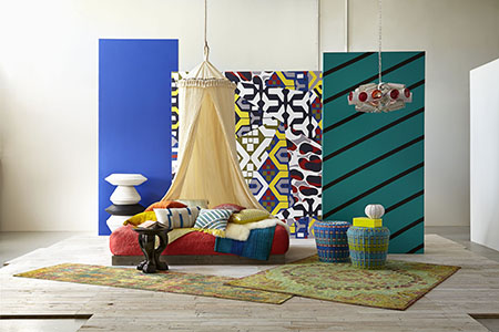
Unrestrained
From bold, ethnic-inspired colors and designs to the Bohemian lifestyle, the Unrestrained palette (shown at top) celebrates a carefree spirit, wanderlust and pulsing color. The palette features saturated primary hues, including sunny yellow, lively turquoise and bright blue, as well as black and white. Each can be used on its own for a pop of color or combined to create a vibrant, energetic space.


